Vis-À-Vis
Developing the Brand Identity and Narrative for Remote Patient Monitoring company out of NYC
- Sector
- Healthcare
- What we did
- Marketing Collateral, Brand Narrative, Visual Identity, Content Strategy & Creation, Copywriting, Decks & Docs
- Tools used
- Adobe
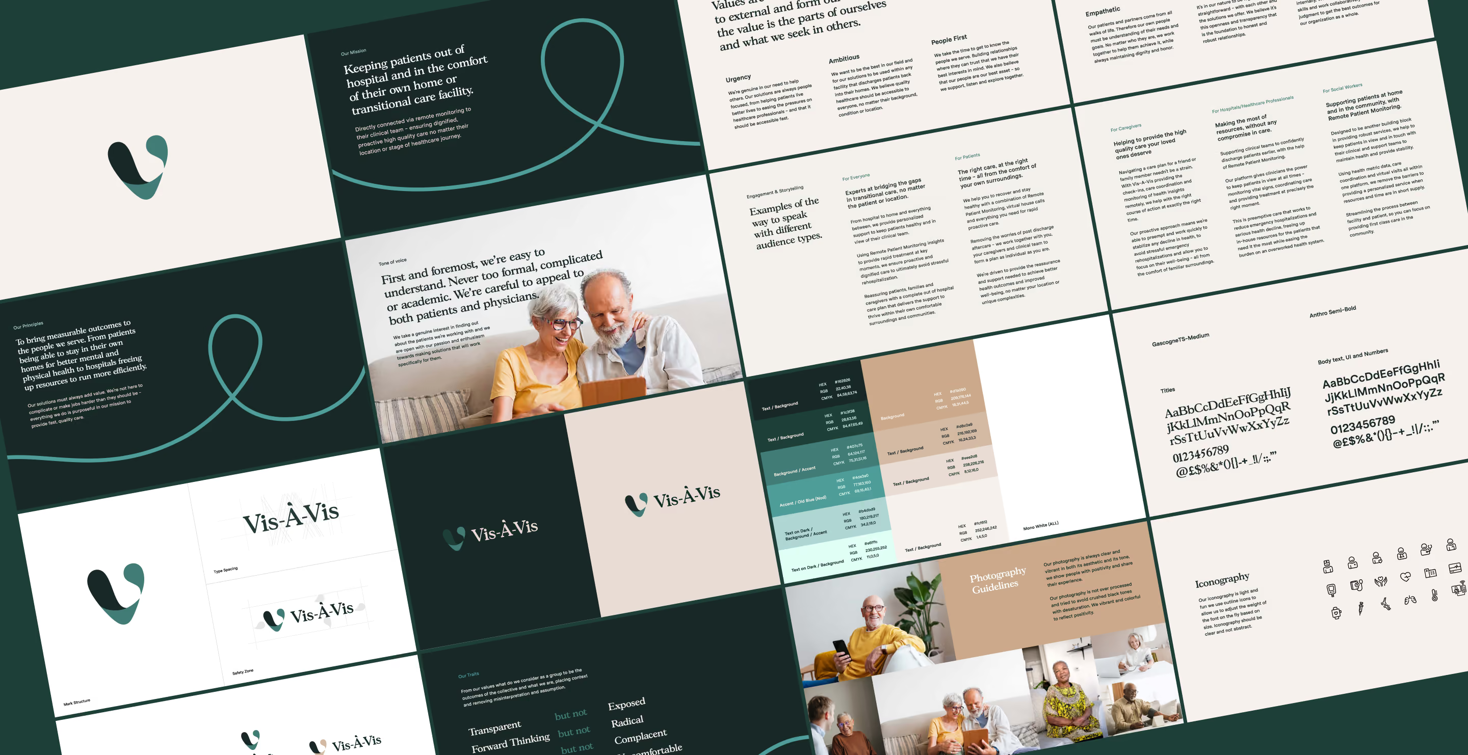
The Brief
Craft a new brand language both for storytelling and visual, which conveys how Vis-À-Vis focuses on proactive care directly to patients' homes and care facilities.
(01)Measurable outcomes
Vis-À-Vis bring measurable outcomes to the people they serve - from patients being able to stay in their own homes to hospitals freeing up resources.
They needed a framework and library of which had a consistent brand story and visual treatment, so we started by crafting the identity and story first.
Vis-À-Vis simply translates to Face to Face.
where the identity started
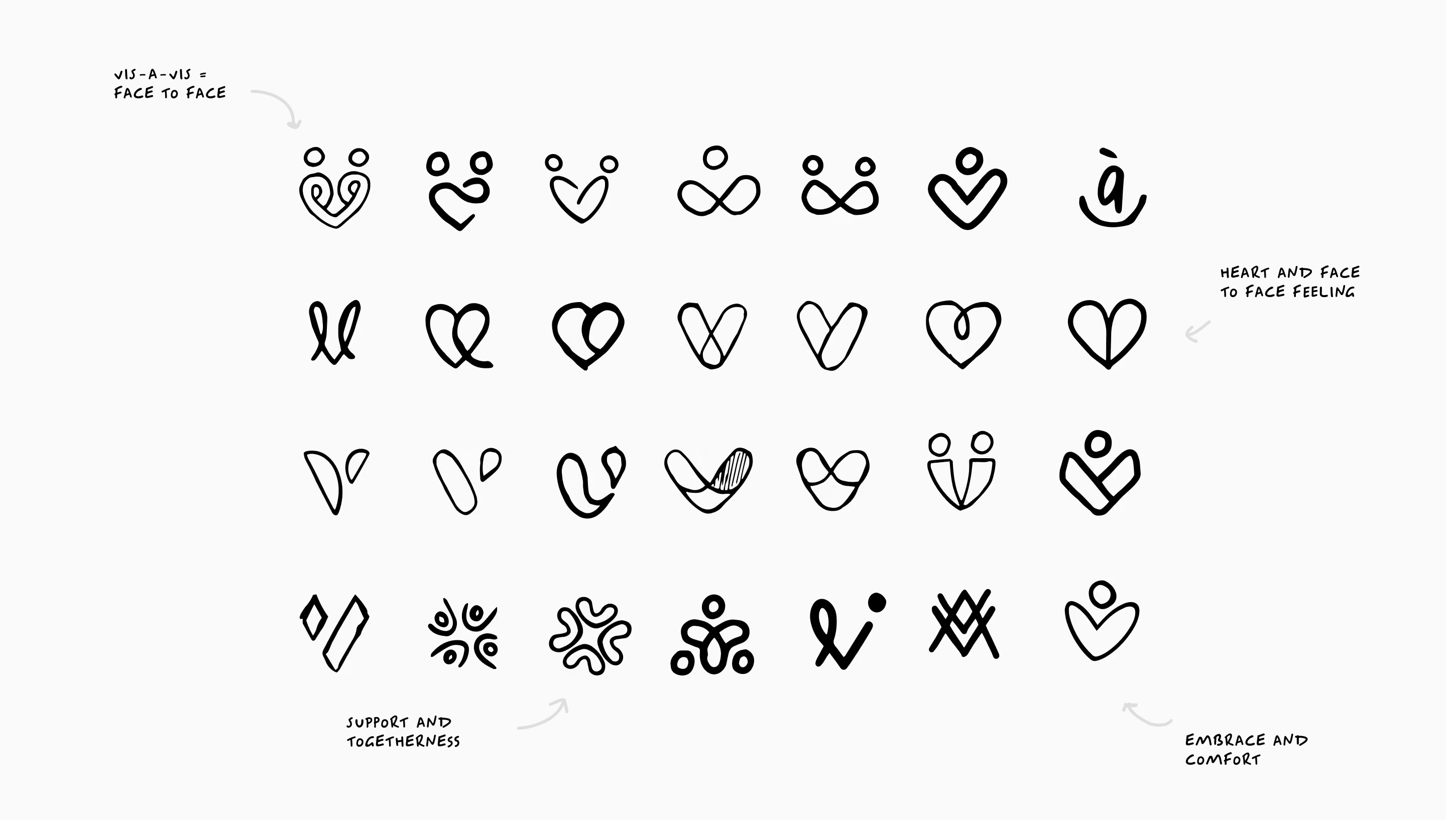
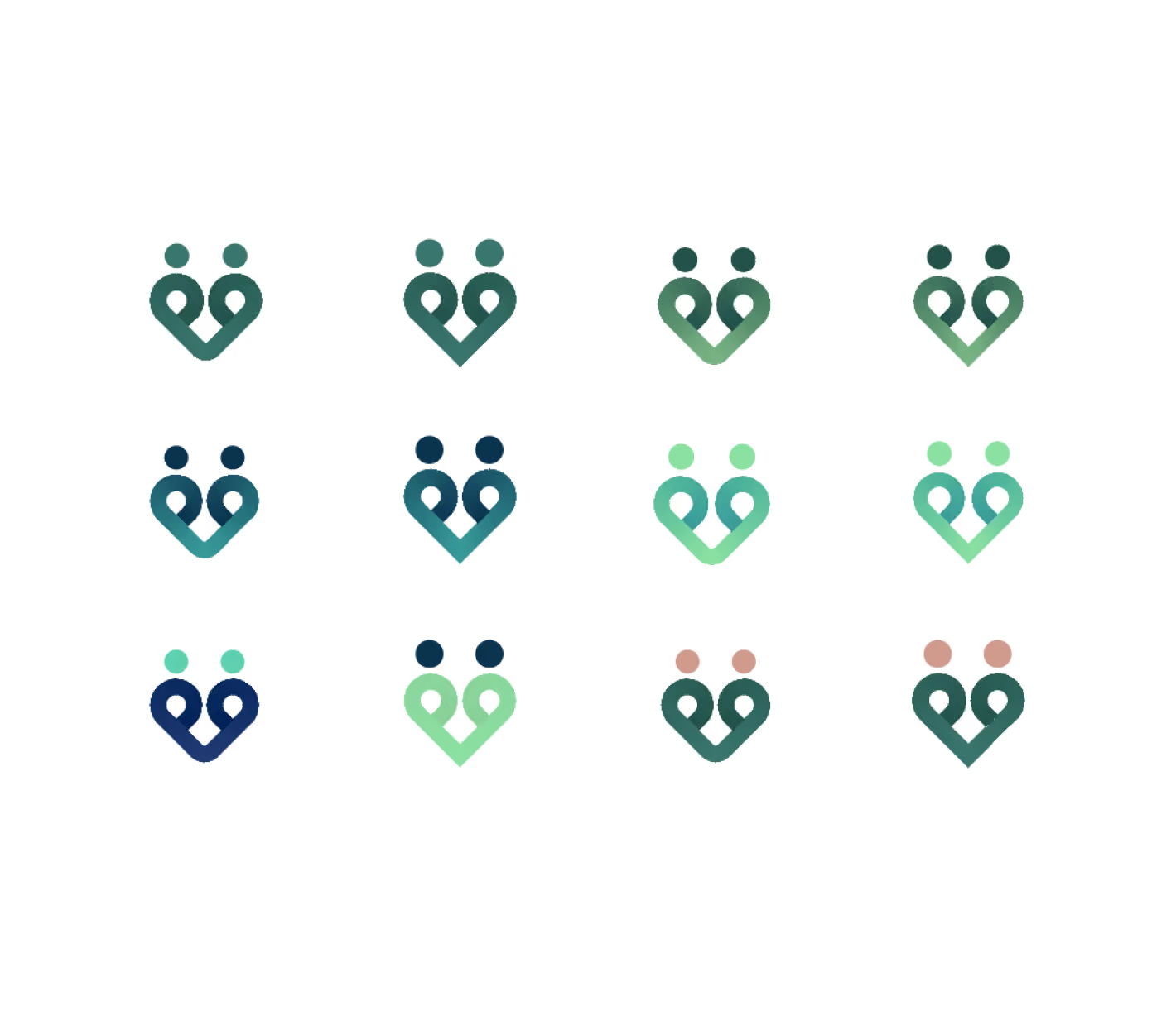
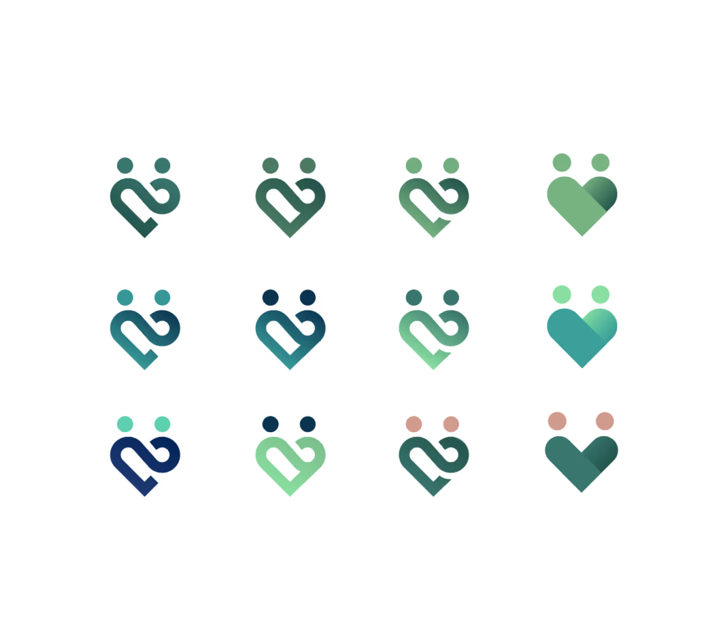


From first marks to final, drag to look through
(02)Comfort and trust
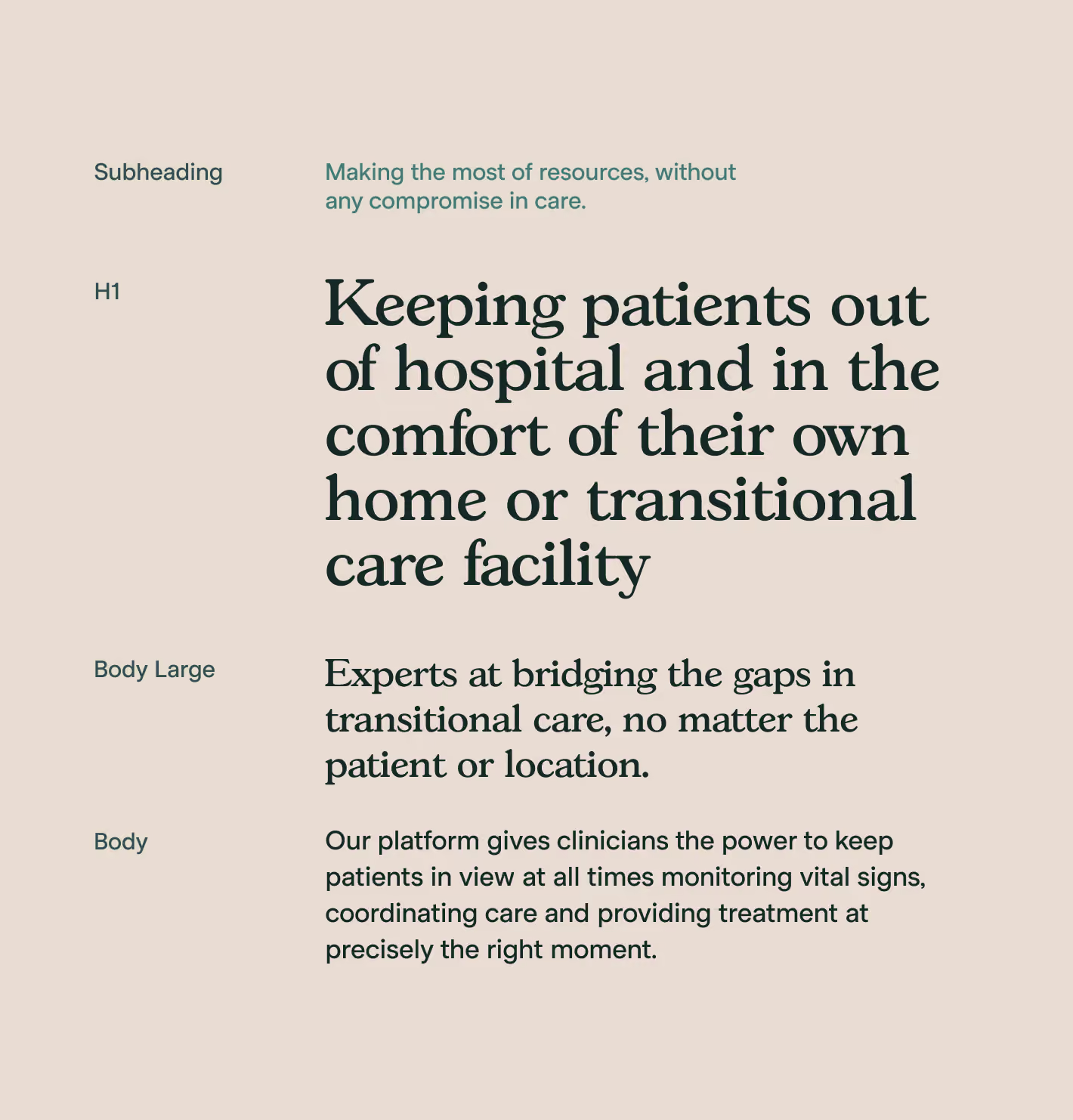
Playing on the idea of remote patient care, we looked at crafting an identity which would feel comforting and secure, with an emphasis on trust.
The team wanted to stand away from the usual color palettes which are synonymous with their industry while not feeling too contrasting to their elderly demographic.
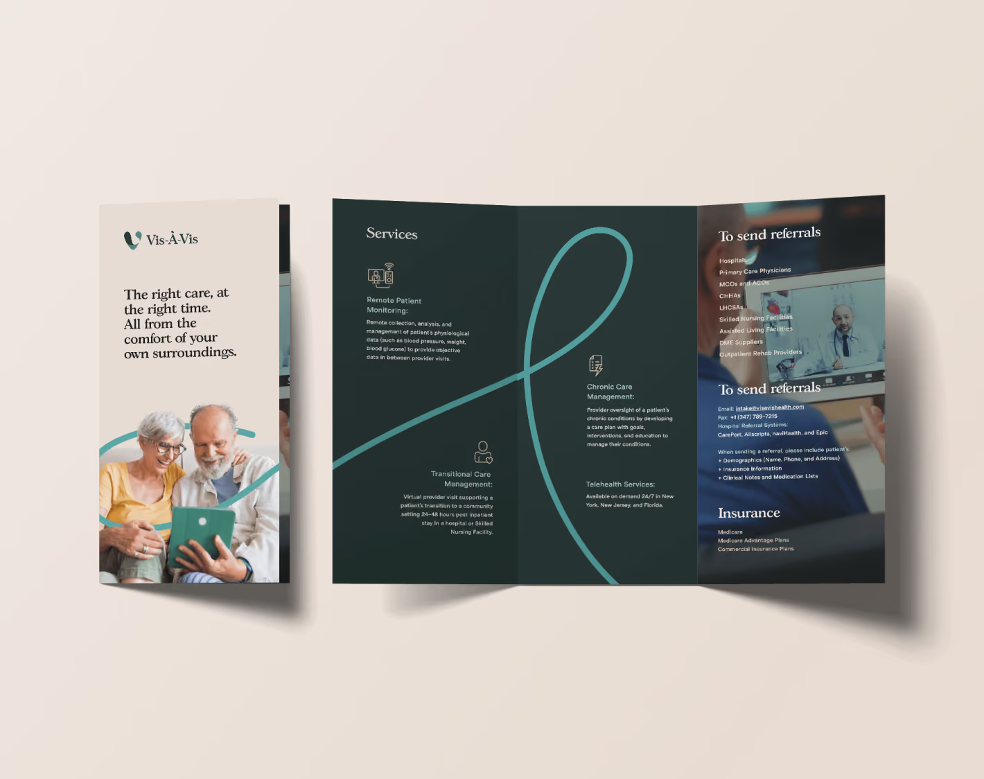
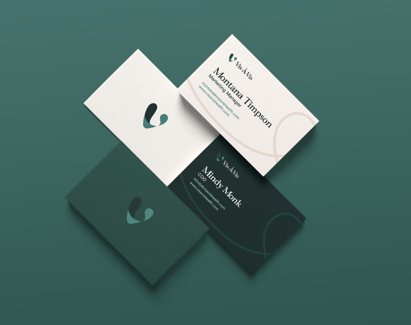
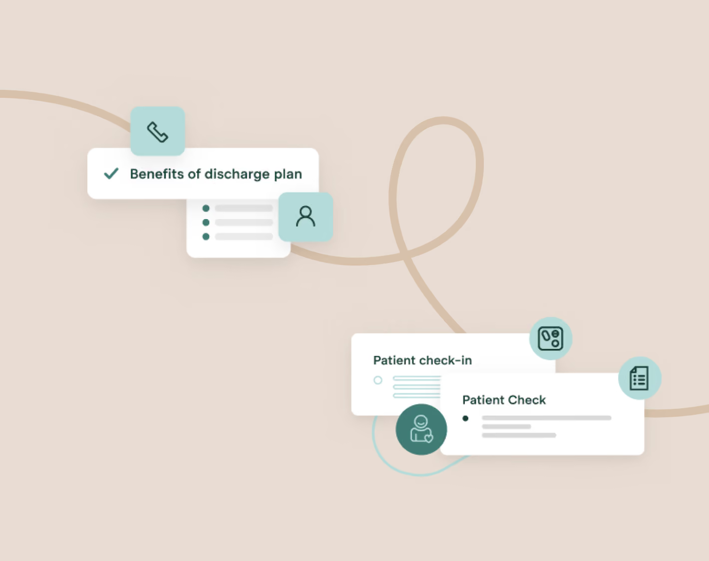
We incorporated the visual treatment of the ribbon to symbolise that patients and healthcare professionals were not alone and the ribbon was the hug (comfort) and support (trust) they would need.



(03)Brand application
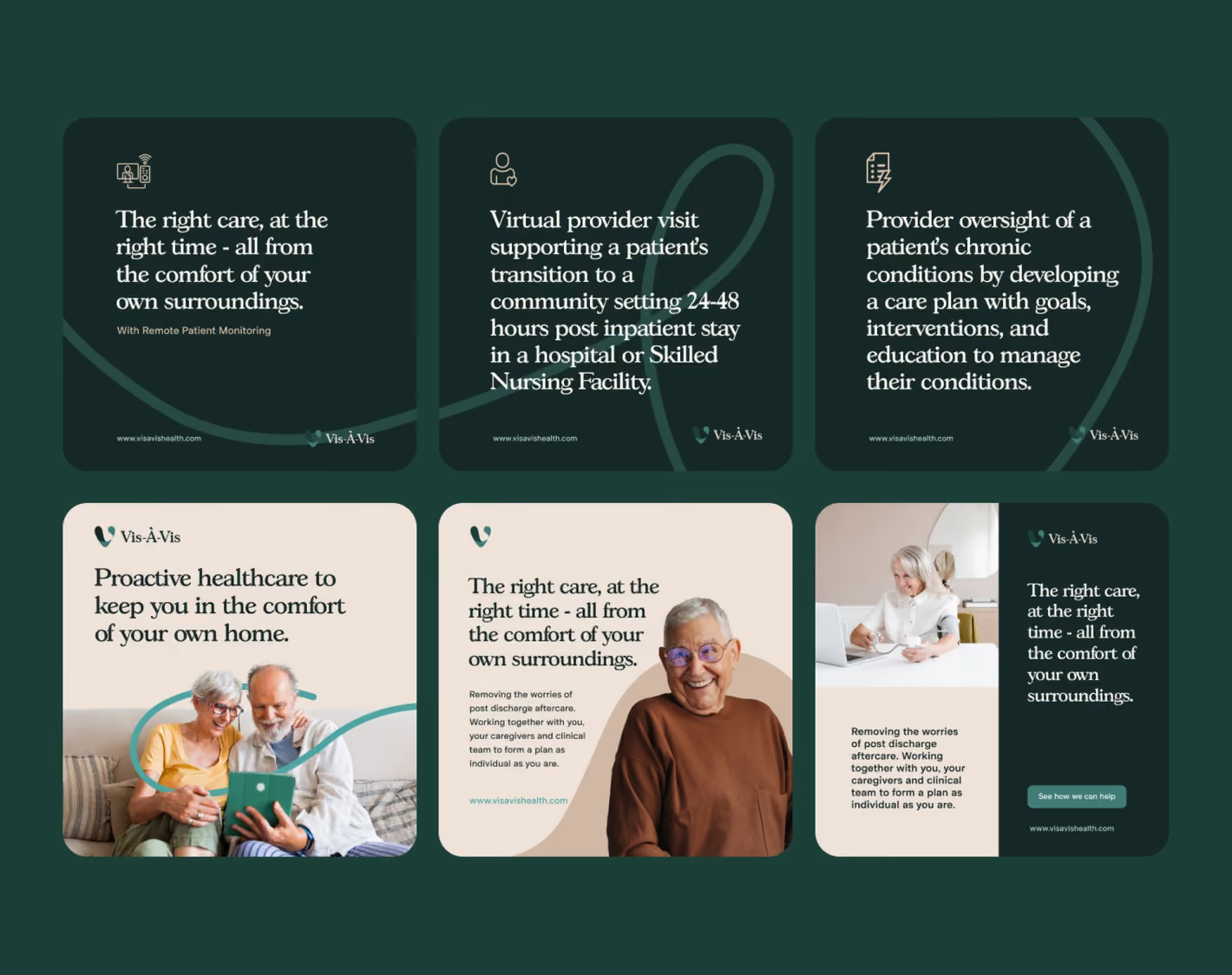
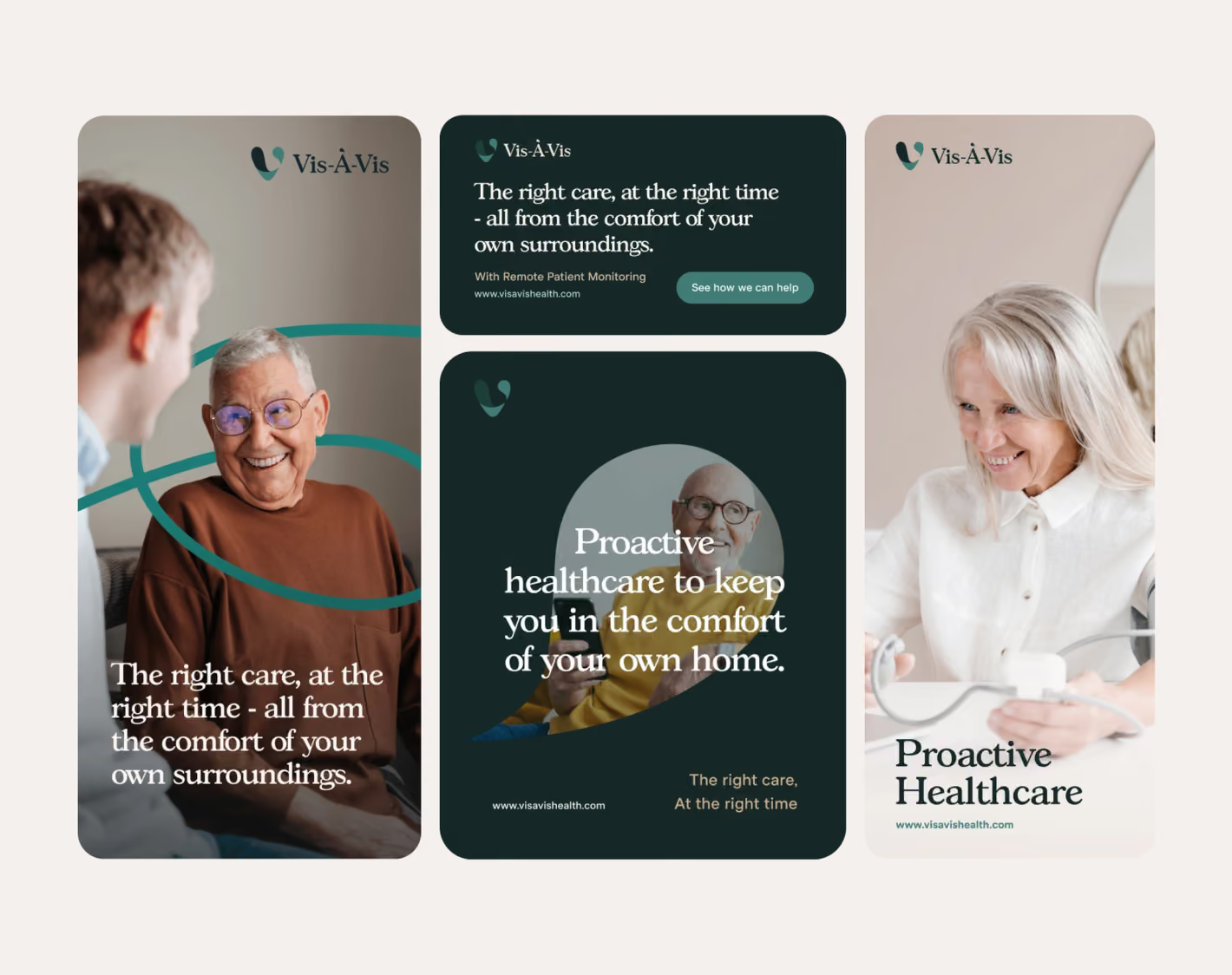
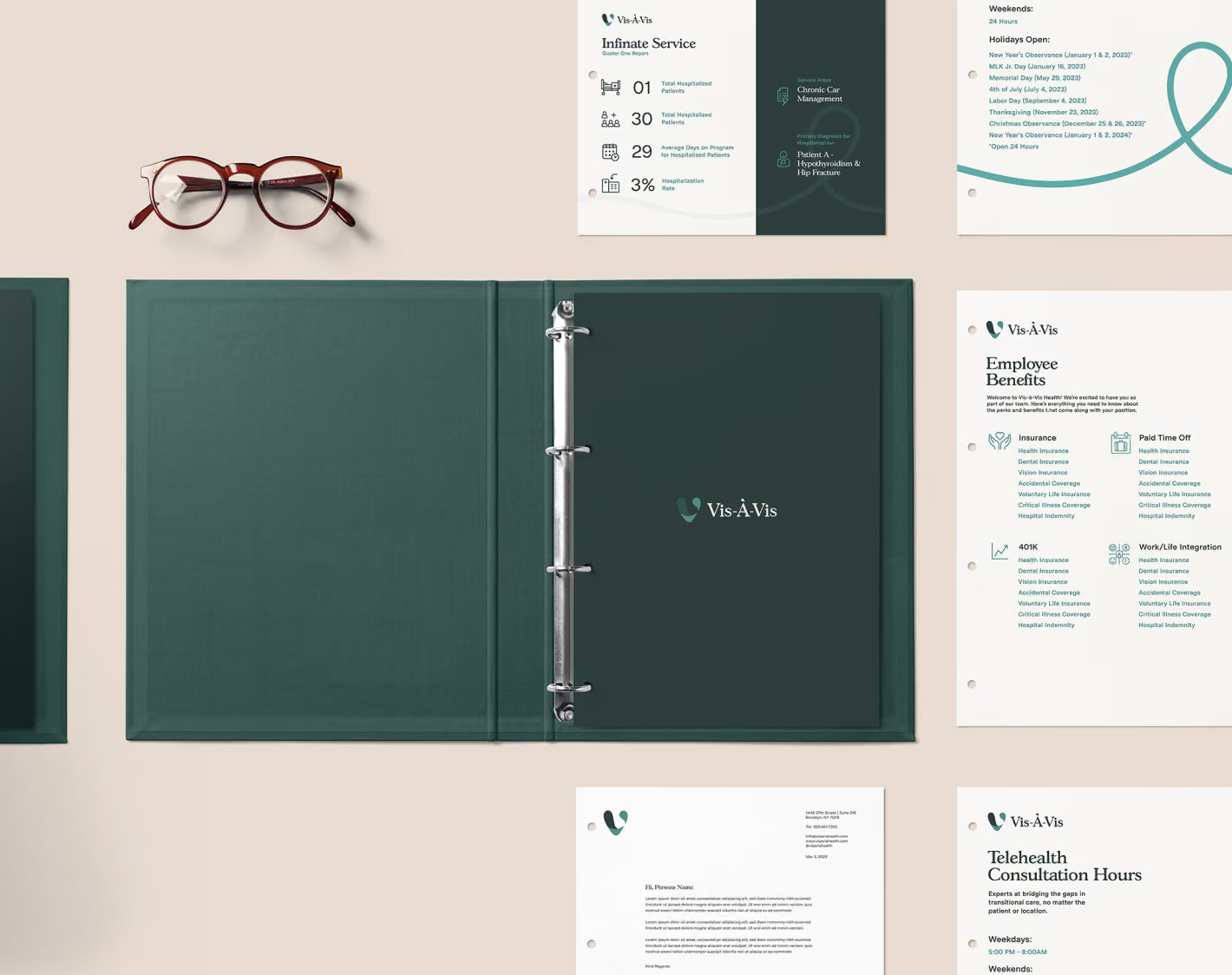
We didn't forget to provide ad and social examples as part of the brand application too.
(04)Pushing back, in the best way
The Vis-À-Vis team were inspiring and passionate and so collaborative during the entire process - sharing all the time and pushing back in the best way, so we could all arrive at the best and most impactful outcomes.
Next project
Sentinel
Property Services
Branding, Web/Marketing/Product Design, Web Development